Enabling no-code store design for merchants
Product: WooCommerce
Role: Product Designer

Summary
Defining the problem & opportunities
The largest plug-in for WordPress, WooCommerce, is in the process of adopting the new WYSIWYG site editor, Gutenberg, to enable users to create their online store or website without the need for a developer or designer.
The initial phases of the project aimed to integrate the default WooCommerce experience into Gutenberg, as well as to investigate potential opportunities for improving the user experience. This involves ensuring compatibility of all WooCommerce blocks (store components) integrate seamlessly with any block theme, developing commerce-specific layouts and templates, determining how store data will be displayed on the front-end, and identifying customisation options for users.
In order to effectively identify opportunities to add value, it was essential for us to gain a better understanding of the problem space and define the problems we wanted to solve. With a lean team, our objective was to build iteratively and add value with each release. However, before we could do that, there were several unknowns that needed to be addressed:
How are users completing the job of customising the face of their online commerce business now? Are we missing any opportunities?
How could templates and patterns differ from business size, type and maturity?
How can we make sure we serve our customers the right store editing tools at the right time?
How do merchants think about pages and templates?
What are the key features and layouts we should prioritise based on user needs?
I held discussions with various stakeholders including engineering, product, and design to address our concerns, determine our biggest priorities, craft a compelling user story, and identify our most significant opportunities.
User Research
To start the process, I conducted generative research by interviewing merchants to gather information. It was apparent from our competitors' activities that visual store editing was becoming an essential part of the e-commerce landscape. While we could gain insights from our competitors, it was crucial to understand the critical factors that hindered our users from building their online stores.
Therefore, my objective was to develop a stronger, shared understanding of the value we bring to our customers with visual editing; we would leverage customer insights to define key problems we can solve for merchants.
To kick off user research, I conducted interviews with a group of ten merchants, a mix of whom were using WooCommerce or another platform. To maintain regular contact with our users, I chatted with a new merchant around twice per month. We knew that we would eventually need to cater to the requirements of store builders and agencies who would also be utilising the tool. However, when interviewing a site builder, it became evident that prioritising merchant needs would add the most value to start with, as builders and agencies demand greater extensibility and customisation features.
Outcomes of the initial research
During the user interviews, I gained several key insights that would inform our product roadmap. Using affinity mapping, I identified common themes and discussed with my product manager and engineering lead how we can shape the roadmap based on these insights.
Insight:
One insight was that users trust WooCommerce and Shopify for their expertise in commerce and expect them to provide best practices for online stores.
Opportunity:
We can reinforce this belief by offering a range of store templates, headers, and checkout experiences and suggesting options tailored to different business verticals.
Insight:
Users focus on designing the homepage and product pages first and seek the most guidance in creating these pages.
Opportunity:
To address this, we will prioritise creating a variety of options for these pages and gather data on what would be most valuable for the majority of users.
Insight: Users also rely on resources like YouTube, blogs, and forums for guidance, but feel more secure with extensions and suggestions from WooCommerce. Managing updates and compatibility with multiple extensions is a common pain point.
Opportunity: To address this, we can improve our communication and provide more support through merchant-facing documentation.
Insight: Users choose themes based on the flexibility of layouts offered and some are using other site builders to achieve their desired layouts.
Opportunity: To address this, we will showcase the possibilities of our store editing features and keep users informed about upcoming design tools.
“...the themes have different features... it would have been better to be able to choose the collection of features into a theme if that makes sense...I wanted some and didn’t need others.”
“I would have liked being able to walk through theme(s) with my developer and cherry pick the features I wanted to keep.”
“I’d like to be more empowered...”
“I don’t know what’s possible. I wish I had more support on what makes a good product page.”
Building blocks
We maintained a set of outdated WooCommerce blocks that were in use on approximately 2000-4000 live stores. These were made accessible through the WooCommerce blocks plugin, which permits merchants to experiment with new editor features that are not yet bundled into the core (default) experience. Unfortunately, the design of these blocks was outdated, and their UX had not been evaluated or modernised in accordance with the progress of Gutenberg.
Imagine if you could break down a website into puzzle pieces, where each piece represents a component or snippet of store data. These puzzle pieces are what WooCommerce blocks are all about. When combined, these pieces create the layouts, sections, and page templates of a website.
Essentially, we would have to start from scratch, and there were numerous components to construct. By leveraging the opportunities outlined from the research, we could define prioritisation. We had already initiated some efforts to design the Cart & Checkout block experience, and we intended to extend this approach to include critical store functionalities, such as:
Mini cart
Commerce headers & footers
Account login areas
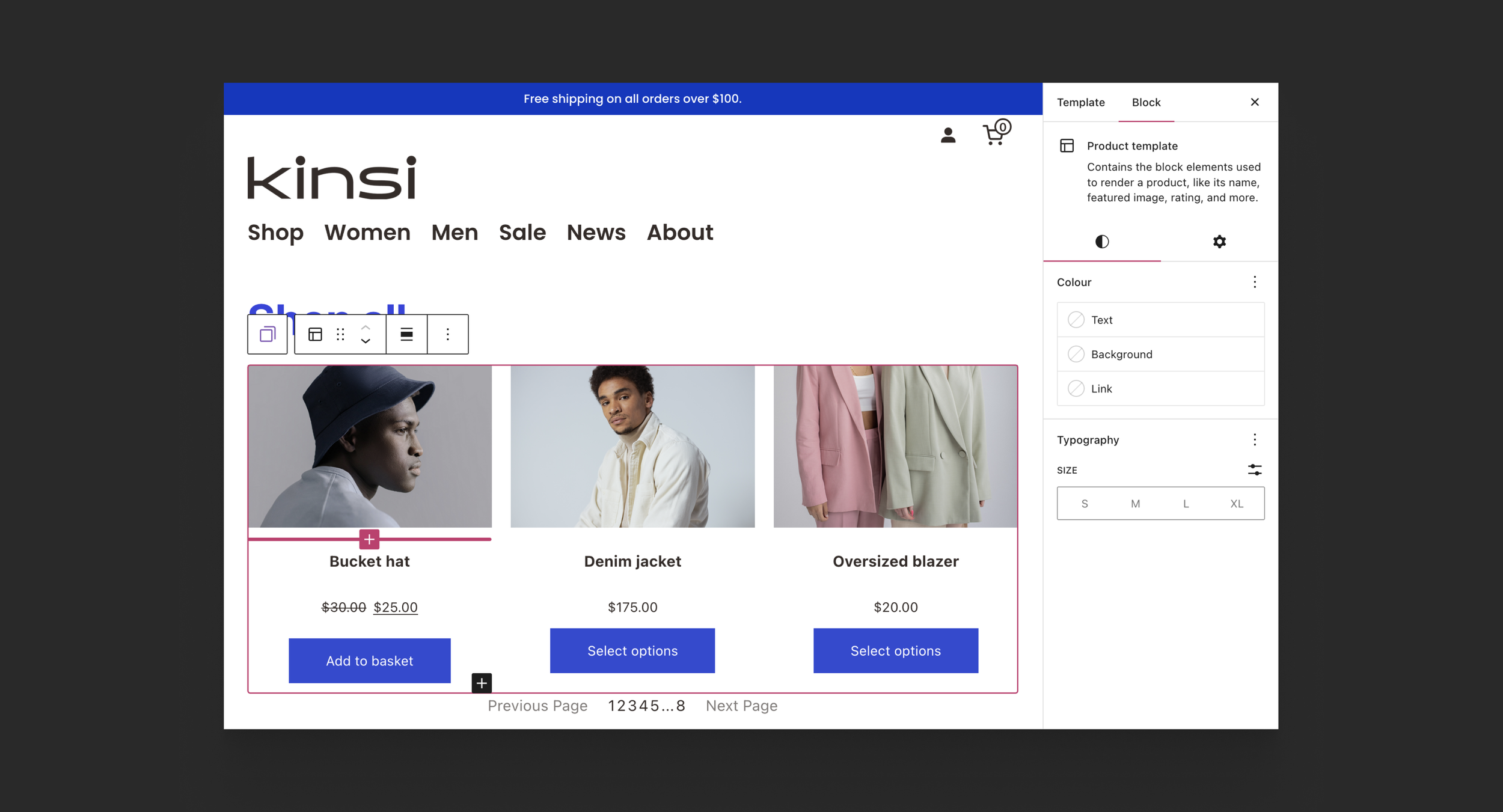
Product grids & filtering
Product layouts for various product categories
I collaborated with the project DRI (engineer) to define the scope of each component, review user feedback and opportunities, understand technical blockers, and determine what the first version should entail. Each component was considered a project in its own right.
Some Significant Enhancements: Making a Meaningful Impact
Checkout: Mini Cart
To revamp the mini cart block in its initial iteration, my objective was to give it a contemporary default design that aligns with users' expectations in modern stores. To begin this project, I conducted a competitor analysis to discover how other platforms offer mini cart customisation, and studied operational stores to see how sellers typically set them up.

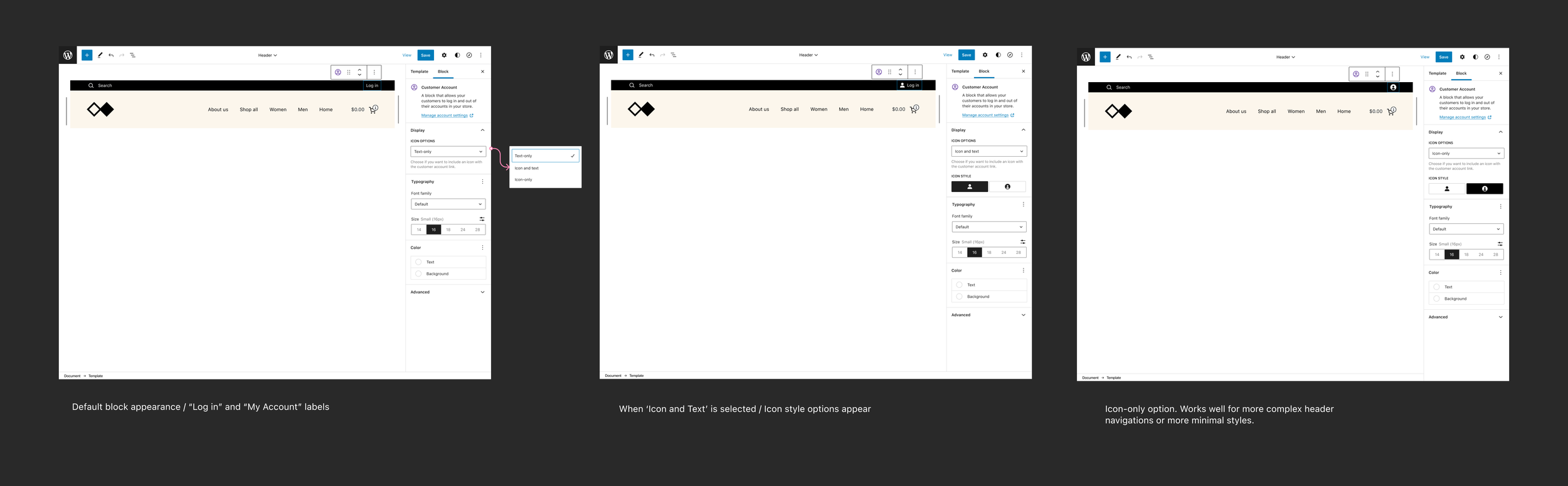
Manage: Customer accounts
The initial design adopts a drawer layout, which is a common pattern for mini carts. We updated the outdated overlay cart with a contemporary design, integrated a visual cue for successful addition to the cart, and allowed users to customise the empty state view.
I carried out usability testing and pinpointed areas for UX enhancement in the next iteration. These improvements involve making setup instructions more straightforward, enhancing the visibility of views, and providing smoother navigation between views.
The WooCommerce navigation included a link to the account section, which generates connected pages such as orders and account information through the plugin. Users had discovered workarounds to customise these pages using extensions and online tutorials. The proposed new customer account block would function similarly to the mini cart block, with different view states for users who are not logged in, logged in, on the login page, or viewing their orders, subscriptions, or account details.